The Assignment
New World Fuel was growing rapidly and needed a brand identity and website that distinguished it from other commodity traders. Its leadership was passionate about comparing the company’s role within the petrochemical industry to the heart’s function within the body. But turning that metaphor into a clear, compelling brand proved challenging.

Visual Identity
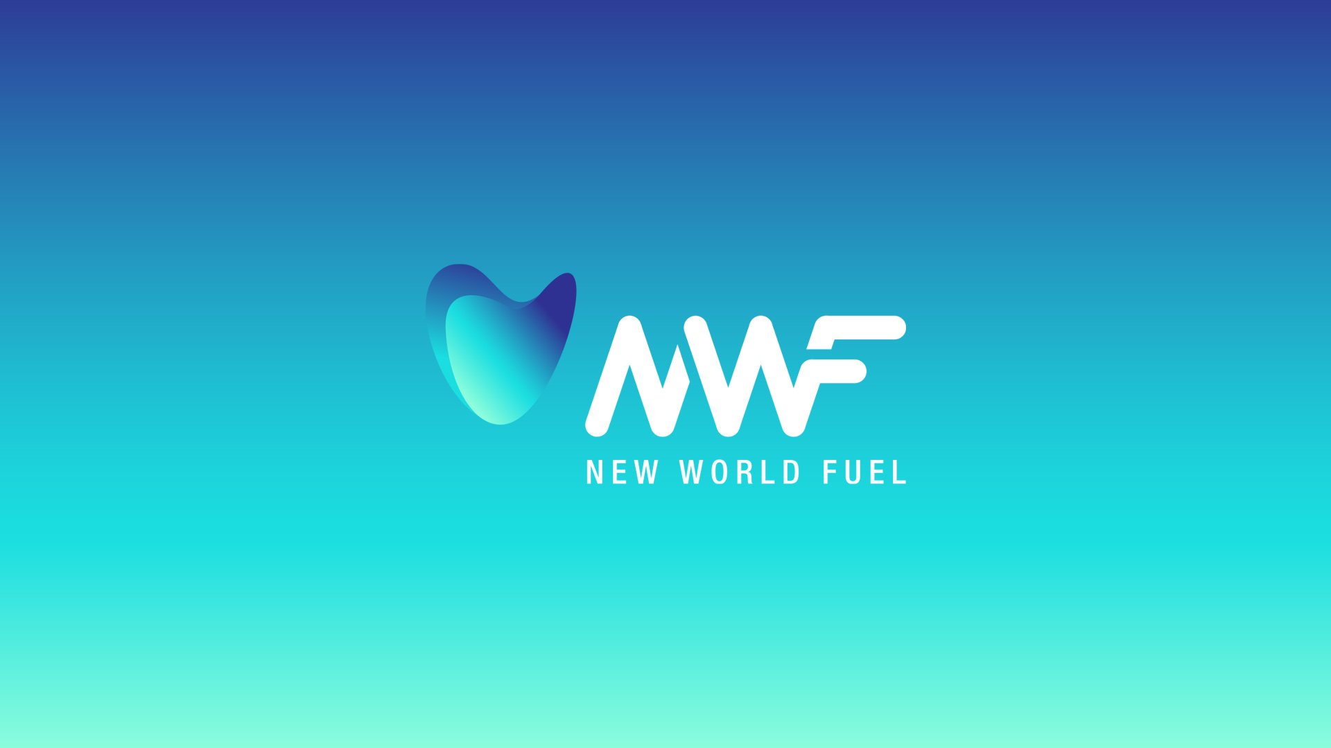
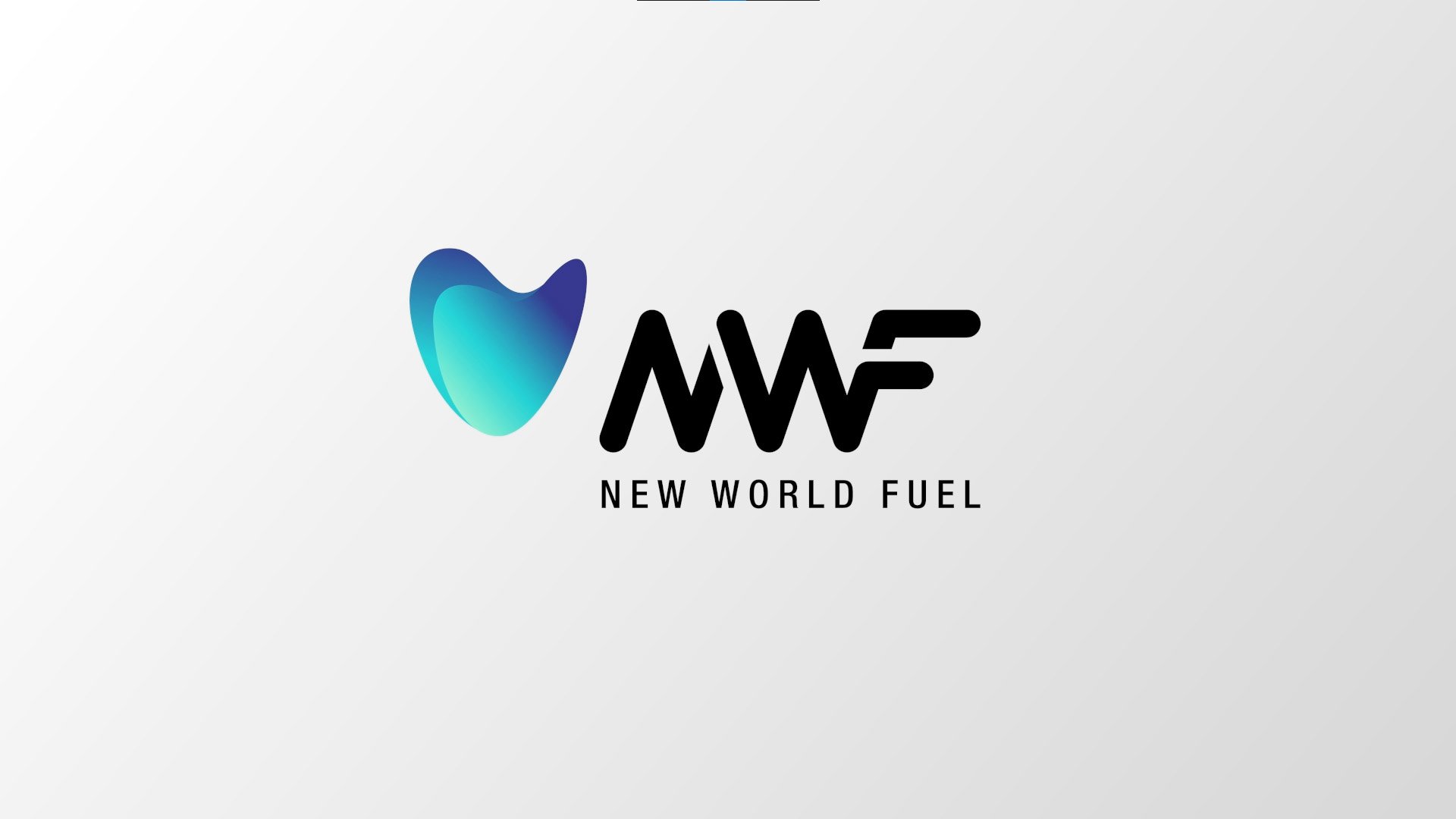
When approaching the company’s brand identity, we knew we needed to be thoughtful about reflecting both the heart analogy and New World Fuel’s industry. The final logo mark features an abstract heart form, subtly shaped and shaded in gradients of blue and purple that evoke a gasoline flame. This approach delivered a modern, energy-centric aesthetic — one that allows New World Fuel to keep its analogy front and center without being mistaken for a medical brand.
Brand Messaging and Video
We crafted a full messaging framework that seamlessly integrates the heart metaphor into New World Fuel’s communications while staying grounded in what matters to its audience. At the core of this work was articulating what it means for New World Fuel to be “the heart of the petrochemical industry.” We brought that message to life in a brand video — a succinct, powerful introduction for customers and partners seeking a smarter, more reliable trading partner.
Website
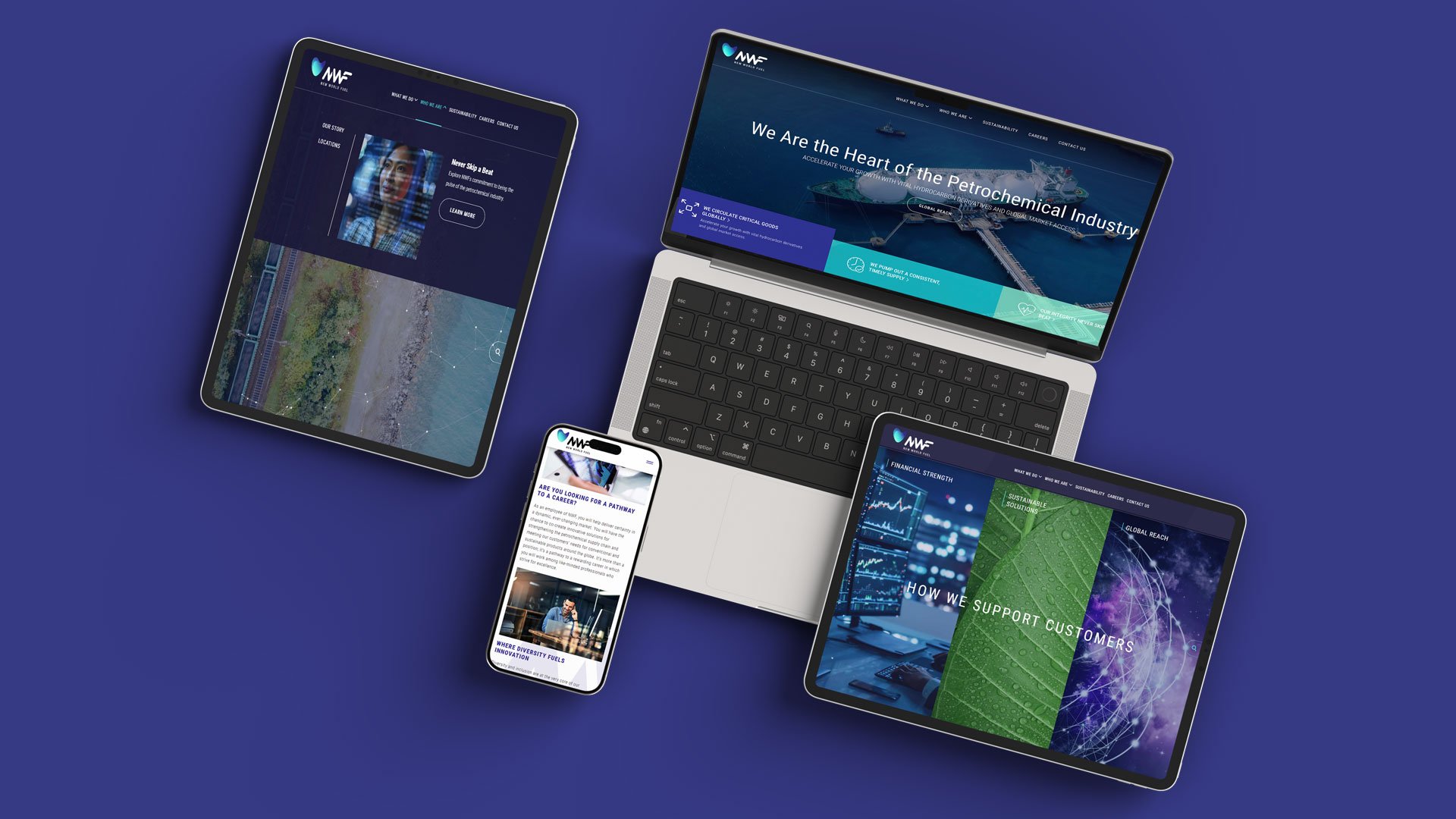
We designed and developed a new website that introduced New World Fuel’s new branding and clearly differentiated the company from other commodity traders. Through the content development process, we collaborated with the New World Fuel team to define and segment its offering — something its previous site did not accomplish. Our turnkey website development also included in-depth training that empowered our client to continue updating its web presence as New World Fuel grows.
MORE GOLDEN EGGS